DES 112 App UI Case Study
PREVENT
SUMMARY
PREVENT is a mobile app that focuses on addressing real-life examples of microaggressions to help users understand common forms of microaggressions. In my DES 112 UI/UX class, I was prompted to design, build, and user test a prototype application that solves an equity issue of our choice.
Microaggressions are subtle commonplace daily verbal or behavioral indignities that can communicate offensive behaviors toward stigmatized groups. So few people are aware of the term microaggressions and often fail to identify what kind of microaggressions exist and their impact. The specific topic of microaggressions relates to equity, as educating people about them can avoid targeting marginalized groups.
This particular project made me reflect on how many microaggressions exist in the world and how little people know about their subtle behavior and implicit bias that affects other people’s feelings.
DESIGN PROCESS
- Discover: Research & Affinity Mapping
- Define: Persona & Goals
- Develop: Ideation & User Flow Task
- Validation: Usability Testing
- UI: Hi-fidelity Mockups
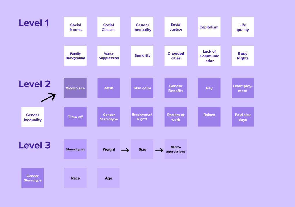
1. DISCOVER
Affinity Mapping – Social Problems
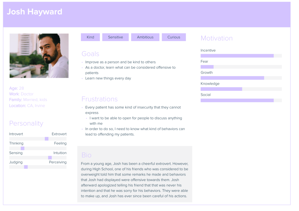
2. DEFINE
Establishing Target Persona
3. DEVELOP
User Tasks
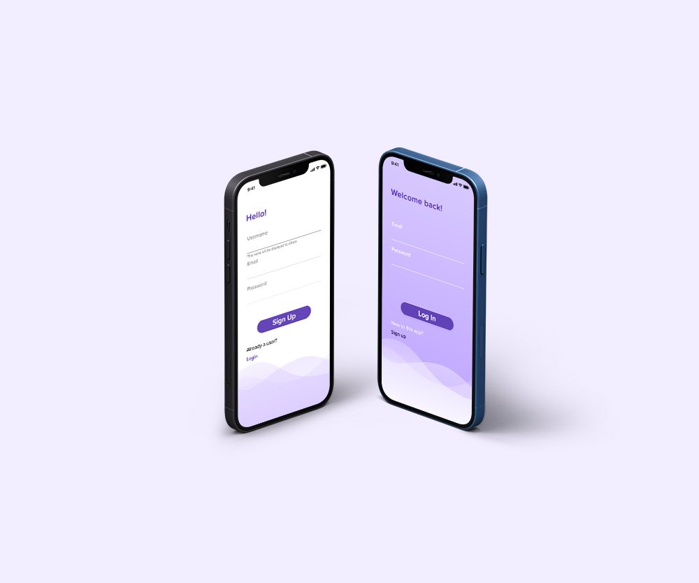
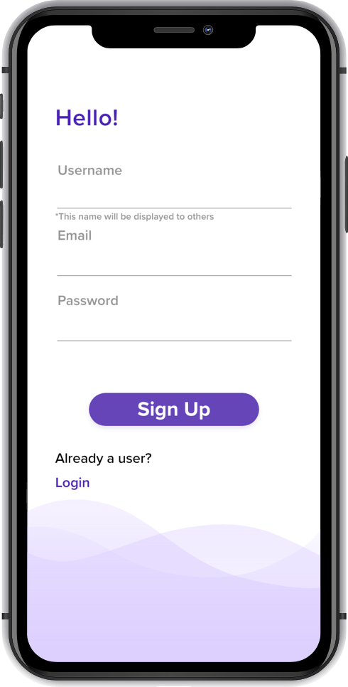
TASK 1: SIGNING UP
User’s Jobs
- Identify whether or not they have an account or not
- correctly enter account information
- Recall login info
- Switch between login or sign up
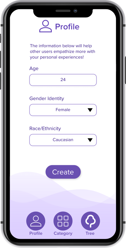
TASK 2: PROFILE CREATION
User’s Jobs
- Input age, gender identity, race/ethnicity
- Choose gender identity and race/ethnicity from dropdown menu
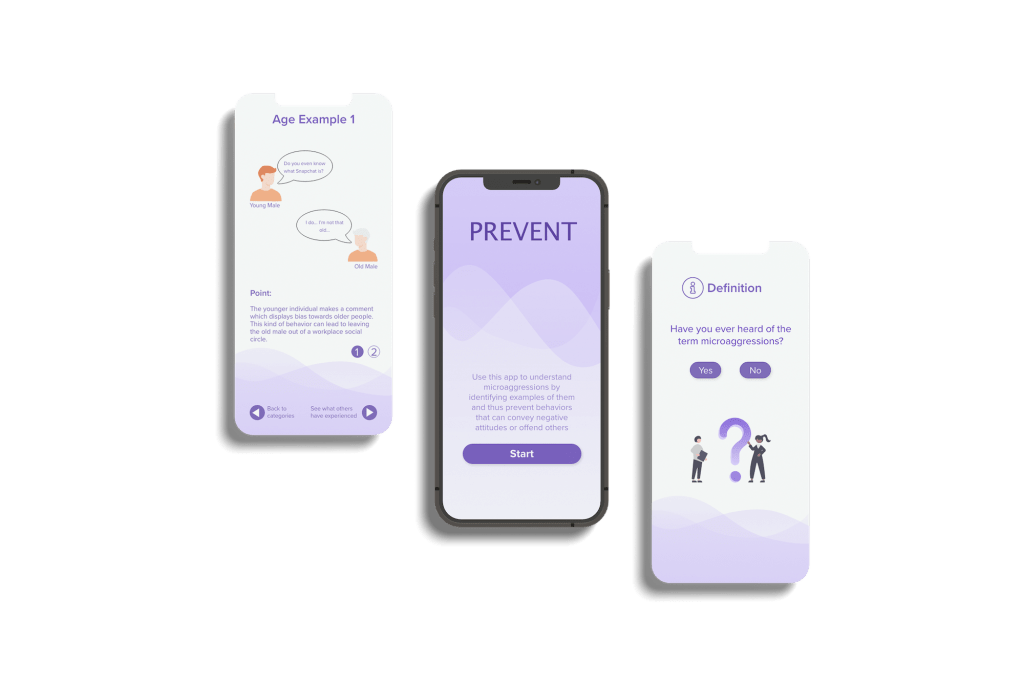
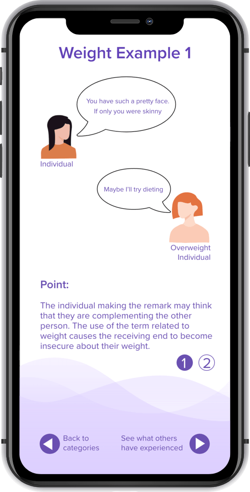
TASK 3: EXAMPLES
User’s Jobs
- Choose category of what the user wants to view an example of
- Associate scenario with real life
- Look at multiple examples
- Choose to look at different categories or proceed to other features of the app
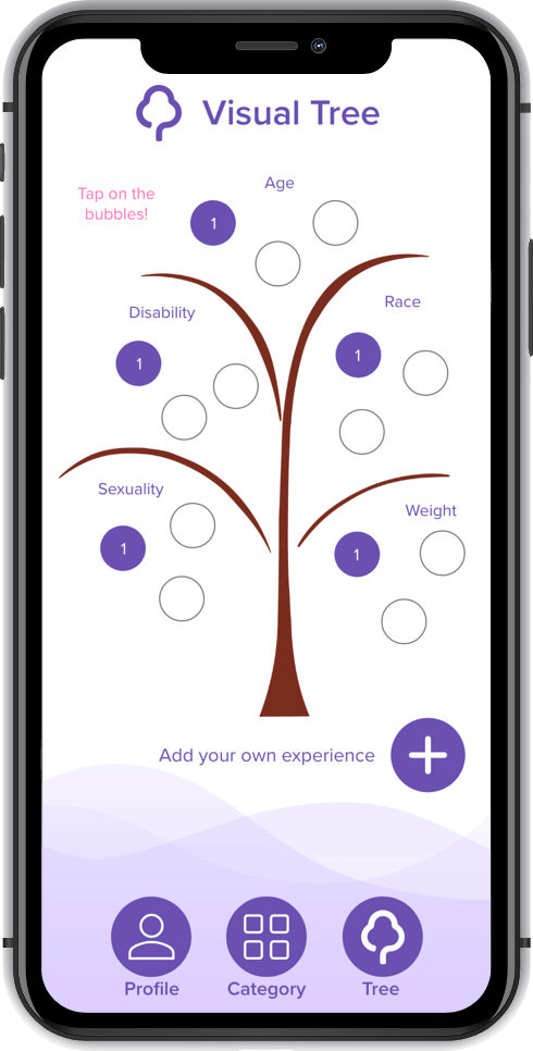
TASK 4: VISUAL TREE
User’s Jobs
- Look at what other people have experienced and gain more information about microaggressions
- Add own comments
- Delete own comments if necessary
4. VALIDATION
Usability Testing
I conducted user testing to find out how I could improve the visual cues for navigating through the screens. Another thing I focused on was finding out whether or not microaggressions were common knowledge or not. If people were unaware of the topic, I would ask whether or not they would be interested in learning about the topic or not.
Logistics
Zoom Video
Conference with scripted remote usability testing
Participants
Four College design students taking the design course
One Japanese College student
Improvements made based on feedback:
– Although the color scheme is clean and easy to see, the overall background is mostly blank and boring: In the final prototype, I decided to be creative with my design and make the app look more aesthetic
– I added another task to the whole application since there was a need to keep the identity of the users the same and keep the data input to be associated with an account
– Updated persona images so that they would have color and have characteristics present rather than blank personas
– Created a more realistic visual tree, separating each category with the branches
5. UI
Final Deliverable – High-Fidelity Prototype